Think about it. You don’t carry your laptop while shopping. And that dusty home computer doesn’t ride shotgun on your commute to work. However, most American cell phone users are never more than 2 feet from their phone.
82% of Americans
never leave home without bringing their mobile device.
[Synovate,
September
2009]
To ignore the growing mobile market is to disregard
your customer’s needs. If you say “not now” to mobile, you will be left
behind
in only 6 short months while your competition advances forward. Some experts say mobile sales and usage will surpass computers by 2011, and increase four times their rate by 2013.
Smart Phone users
are expected to increase four-fold by
2013
[In-Stat via C-Net News, March 2009]
Apple Inc.’s Steve Jobs said Apple has sold more than 85 million units of the iPhone and
the iPod Touch media player combined, with iPhone sales alone topping 50
million.
[Bloomberg Business Week, April 2010]
Mobile surfers spend less than 5 minutes each site
seeking the exact information they want.
In fact, you might not even call them “surfers” anymore… while web surfing was cool to waste time on the PC – no one wants to waste time on their cell phone.
Is your company ready with a Mobile-Friendly Website to accommodate your
clients? In a world where everyone owns a mobile phone, your
brand perception will dramatically decrease when your website presents
the
wrong content, in the wrong order, with painfully slow downloads.
Difficult to
find action items like e-mail or phone numbers frustrate “on the go” mobile users.
Users are 35
percent less successful completing website tasks via their mobile phones than
they are on a regular PC.
[Nielsen Norman Group via Mobile Marketer, July 2009]
The average success
rate in completing various tasks on the mobile Internet is just 59%, compared
to an average success rate of 80% for websites on a regular PC.
[Useit.com,
July 2009]
Back40
Design Group has built
award-winning websites for the last 10 years. With over 300+ Oklahoma
companies
utilizing our exclusive Javelin® Content Management System, it was a
natural
fit that Back40 continue to lead the way in technology advancements,
including
Search Engine Optimization and Mobile-Friendly Websites.
We are proud to create your Mobile
Site with specific easy-to-use features for iPhone®, Blackberry®, and
Android®.
The “Mobile Movement” truly caters to your client’s Smart Phone needs.
Case in point – www.back40design.com saw 145 mobile web hits in the entire year of 2009. With such a sharp spike in Smart Phone sales in 2010, we now average 141 mobile web users in just 60 short days! That’s quite an increase, and certainly shows the fast, progressive movement toward mobile devices requiring website compatibility.
[Back40 Design Group Google Analytics,
May 2010]
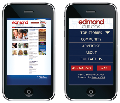
A Mobile Website is different than a typical PC website because it adheres to the philosophy “less is more.” It allows 1-touch
access with “click to call” or “click to view map” features. Less photos equate to less load time on the mobile phone. And less text or content directly reduces mobile user frustration, making it easier to find key, important information. A Mobile Website also has no horizontal scrolling, and limited vertical scrolling for ease of use.
Today’s search engines can recognize a computer user
versus a mobile user. Back40 Design Group makes it easier for mobile-specific search
engines
to quickly find and display your mobile website to their phone,
while not
affecting typical laptop or computer users who want to see your
full &
robust website.
How do I know the
website is being viewed by mobile devices? Back40 Design provides extensive reporting capabilities
in one, easy-to-use website – Google® Analytics. You simply log in
and click
“Mobile” to view your stats:
Mobile Devices: Stats
for iPhone®, Blackberry®, & other mobile devices are displayed.
Mobile Carriers: Detailed
information on mobile & and carriers are displayed.
Visits: Shows
how many hits your website receives specifically through mobile devices.
Pages/Visit: Details
how
many pages the web user viewed during a certain mobile visit.
Average Time on the Site: Shows how
long each mobile user viewed your website.
% of New Visits: Defines
whether mobile users are new to your site, or returning visitors.
Don’t be left behind. Stay ahead of your competition with the latest technology.
Call JR Ross at 405-478-4080 today to discuss your Mobile-Friendly Website options!