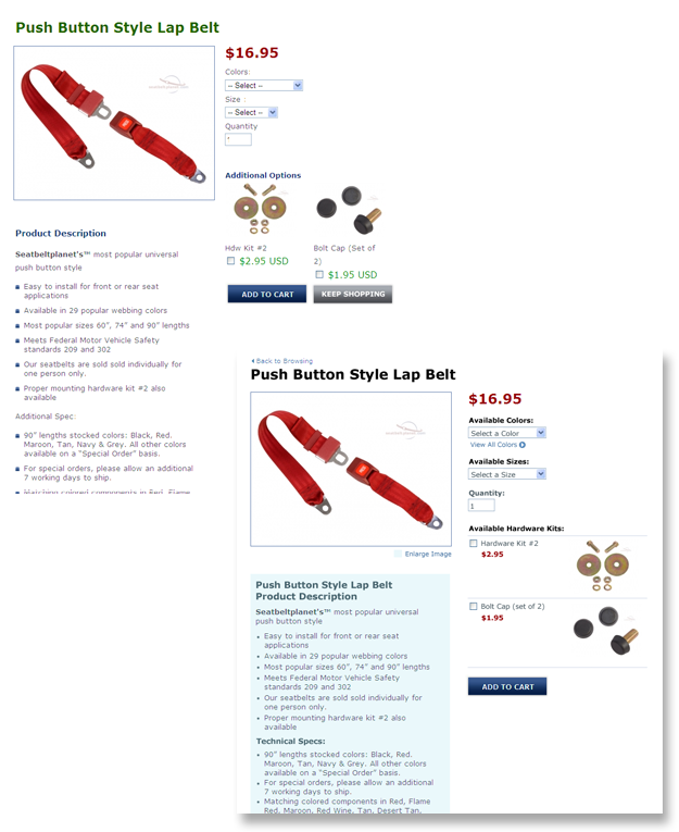
Here are a list of a few improvements we made to the Beam’s Seat Belt Planet website. The website was built under a tight deadline for a major industry show. We recently had the opportunity to review the e-commerce portion of their website and make improvements.
Here’s a short list of improvements aimed at improving the user experience:
Left Column: Product Information
- Added ‘Back to Browsing’ link to increase ease of navigation. The link was placed above product title. There was previously no link back before.
- Changed the color of main product title from blue to black. Black increases the visual impact and anchors the rest of the supporting information on the page.
- Added a link to ‘Enlarge Photo.’ Previously the user was supposed to intuitively know that clicking the image would link to a larger version.Added product title to product description area. Increasing relevant search term frequency within the page.
- Added product description and alt tag (in code). Also increasing relevant search term frequency within the page.
- Decreased leading (space between lines of text) of product description to shorted the depth of page and reduce scrolling.
- Removed custom bullets that were distracting.
- Relabeled the ‘Additional Spec’ title to the more descriptive ‘Technical Spec’ title.
- Added light background behind product description to help organize page information.
Old version at top; revised version at bottom:
Right Column: Form Action Items
- Rewrote the color and size field labels by adding the word ‘Available’ in an attempt to make language of order form action items more friendly
- Rewrote the default messages in color and size fields (ex: –Select–) to be less distracting and more relevant to the form item action
- Bolded all field labels to increase visual impact of action items.
- Changed color of all field labels to black to increase visual impact of action items as well.
- Added ‘View All Colors’ link to pop open a pallet display for color-to-color comparison.
- Relabeled ‘Additional Options’ to ‘Available Hardware Kits’ to better describe listed items.
- Rearranged layout of hardware kits to stack vertically rather than side by side, allowing for easier browsing and less frequent use of divider lines (with 2 or more displayed kits).
- Shifted form check boxes to left edge to visually align with other form items.
- Changed color of hardware kit price text to match associated product price.
- Removed the ‘Keep Shopping’ button (next to the ‘Add to Cart’ button) increase focus on the form’s call to action.
Usability design is often overlooked or rushed through by web teams, but is a crucial to a successful web project. Here are a list of skills that I believe are VERY helpful in usability design:
- Graphic Design: a solid knowledge of graphic design principles is helpful in page layout and creating clear information hierarchy.
- Product Design or Industrial Design: Understanding of how people use products. This encompasses physical interface with product, paths of actions and effective use of communication.
- Form Design: Applying best practices and established methods of form design will short build cycles and increase product quality.
- Empathy: Understanding your users – what annoys them? Is there a way not only annoy them less, but actually enjoy the task of filling out a form?
Most all interaction on websites in form-based. Action and re-action. Understanding users and form design is essential to creating awesome websites – and happy clients.