A good logo is one that effectively communicates the value and quality of a brand by both it’s form and function.
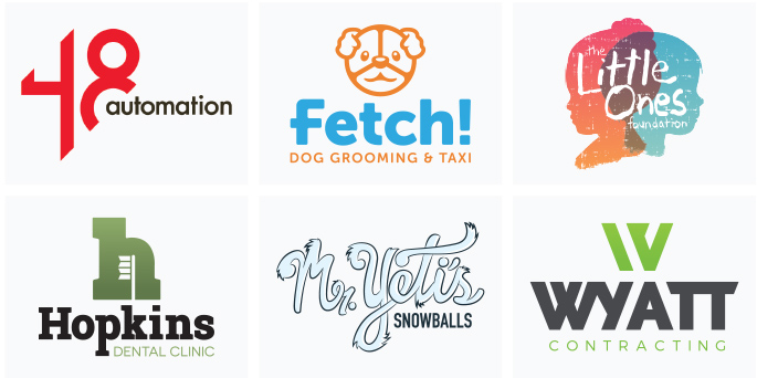
You may be thinking… “logo, identity, brand… yeah that’s all the same thing right?” Nope.
While these terms often get used loosely and sometimes incorrectly, each is a unique aspect of a company’s visual perception. A logo is the face of your company, the visual handshake, if you will. It provides a first impression to your audience. The identity is a combination of visual assets, both physical and digital, that help define who you are in your market. Lastly, the brand is the overall emotional perception of your company, established through the ongoing use of your logo and marketing collateral.
Finding the diamond in the rough.
A great, long-term Back40 client, Impact, came to us recently needing to update components of their logo. After discussing it further, we agreed that the logo as a whole needed a fresh look that would keep up with their growing business and continue to serve them well for years to come.

Not every logo needs a complete redesign.
As a designer, what I love about these kinds of projects is that not every logo needs a complete redesign. While it’s exciting to be involved at the ground level with a new company, there is also a pride that comes in helping an existing brand reach new heights. In this case, Impact has established a brand presence in their market, and they’re proud of that. They should be. Hard-earned business and a solid clientele is not something to treat lightly, so our goal was to maintain their brand recognition and reputation as a part of this logo update.
Indicators of a Needed Refresh
Deep down, everyone craves balance. You find this throughout nature, and on a subconscious level people are drawn to things that exhibit good form. A design may not look “bad” on the surface, but a lack of good form can make people uneasy on a subconscious level.
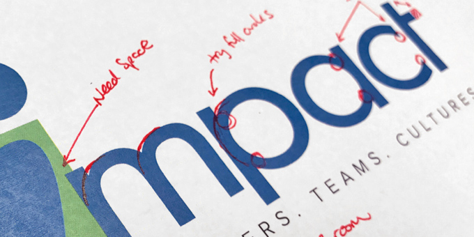
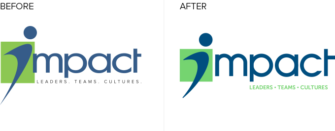
For Impact’s existing logo, the letterforms had a tapering effect toward the joints. This was particularly noticeable on the “c,” and gave the letters an unnatural feel.
Seemingly subtle adjustments can have a significant effect on the perceived value and connection an audience has with a brand.
My first goal was to recreate the letters starting with the “p” and “a” using perfect circles. This immediately created a sense of balance that could be applied throughout the rest of the design.
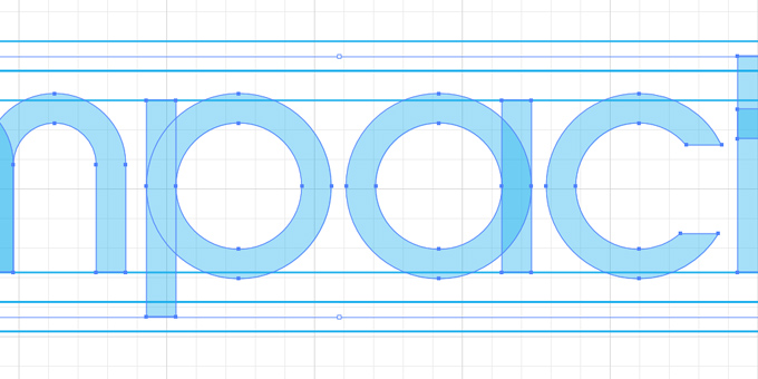
I also adjusted the shape and spacing of the mark to add to the balanced feel, ie. a square rather than a rectangle. The “i” in Impact was originally designed to symbolize an individual ‘leaping’ forward into the new. In this new mark, I adjusted the physical orientation and proportion of the “i” to aid this goal. I also reduced the points and rounded them slightly, to make the mark more approachable. These seemingly subtle adjustments can have a significant effect on the perceived value and connection an audience has with a brand.
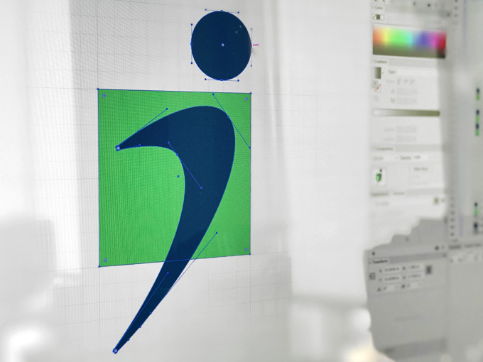
Impact’s tagline placement was another area of concern. In the original design, there was very little breathing room within the space allotted, which made the logo feel cramped. To remedy this, the tagline was strategically aligned between the descender of the “p” and the vertical bar of the “t,” giving it a defined space while maintaining that much-needed breathing room. The typeface of the tagline was then adjusted with a thicker sans serif to improve readability at smaller sizes and from a distance.
In order to achieve brand recognition, the logo needed to stay true to the established color palette.
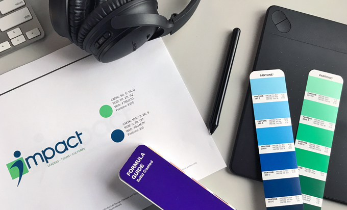
In addition to the shape and form of the logo, I also explored color application. I knew that in order to achieve brand recognition, the logo needed to stay true to the established color palette. Greens and blues were still very important, but we modified the shade of green to reduce the warm tones and punch up the brightness.
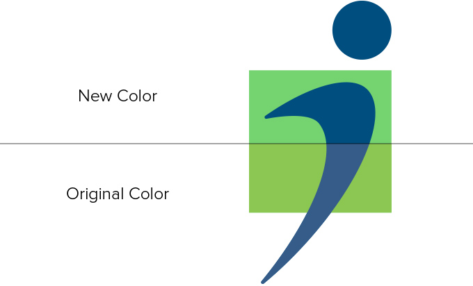 The resulting effect gave the green a “mintier” look which denotes a certain freshness and vibrancy. We also took a look at the contrast values of the colors and found that the original green and blue were very close on the color spectrum, which causes the eye to blend these elements. This was particularly noticeable when we viewed the logo in grayscale or a monochromatic shade. To remedy the issue, the blue was darkened and saturated a bit more. This provided some much-needed contrast against the new mint green.
Producing the desired outcome.
In conclusion, the logo refresh was a tremendous success! Our client was pleased with the outcome. They’re happy to see the qualities they liked from their original design shining through. They now have solid logo design built on sound architecture, with good form. It includes the symbolism they wanted originally, but now it more accurately represents the quality and value they offer through their practice.
Does your logo need a refresh or perhaps a new look?
Get in touch with us today, we’d love to talk with you about it!
