We recently had the opportunity to upgrade a legacy client’s website (legacy = long time). The upgrade essentially consisted of integrating Javelin CMS, our proprietary content management system, into the existing website structure. By integrating Javelin CMS, we would increase updating and content creating capabilities. The Javelin framework would also support additional (and economical) upgrades and redesigns in the future.
Although the project was not a redesign, we were able to add value to the project by simply modifying some of the user controls of the website – while we added our Javelin CMS. Small usability improvements can make a big difference. Saving a click here or there – or making a search function easier to understand may not seem like much, but simple changes like these add value and should be implemented on any website project.
Improving Usability of a Search Function:
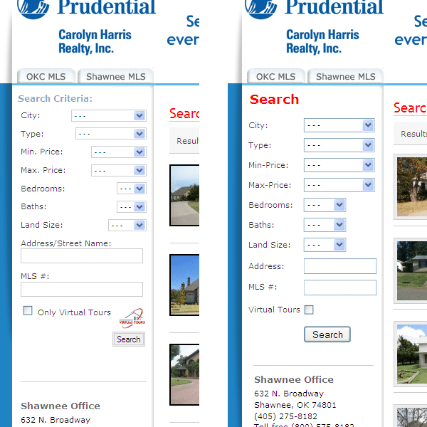
The search function is present on every page of the website, that feature was carried through on the updated website. Re-arranging the labels and fields is a simple way to improve a user experience. The previous search function displayed the label/input field relationships in two ways: at the top of the form, the labels were NEXT TO input fields (City through Land Size). Lower in the form, the labels were displayed OVER the input fields (Address and MLS #).

With a little rearranging, we were able to standardize all label/input field relationships to be displayed as label NEXT to input field. This simple revision gives the search form a more organized look (and a quicker read for the user). Plus, we were able to save two lines of vertical space, which could mean less scrolling for smaller screen users (like laptops).
With minor code revisions, we were also able to align the left margins of both the description and the fields. This presents the user with a more organized form. In this alignment, we also repositioned the check box and the search button to line up with all possible user functions. We then adjusted the width of the fields to further present the user with a more uniform look. And finally we eliminated the ‘visual tours’ graphic that was placed next to the check box description. It was distracting (not a description, field or input function) and was too small visually to add any value to the preceding label.
Improving usability can be as simple as editing a label. The search function label on the previous website read ‘Search Criteria’ – we thought it would be more intuitive if we simply labeled the search function ‘Search.’ ‘Search’ directly says what the function does, and is an action word. We also revised the color and font weight of the text to improve visibility of the heading. Some would argue that the text color, red, is not the correct choice for text other than a warning – but we went with it, because it emphasized the most important feature to the client.
An added usability benefit of revising the search function was also found in raising the form elements higher in the page, if only by two lines of text, to help eliminate scrolling for the user utilizing a smaller screen (or a laptop).
Improving Usability Search Results Display Controls:
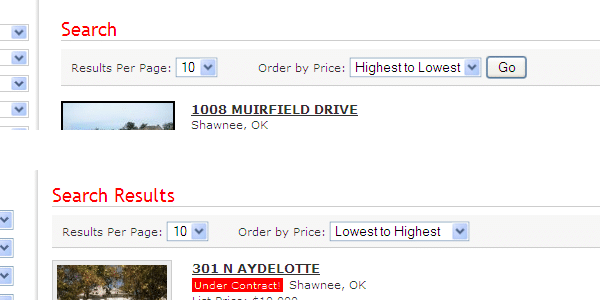
At the top of the search results display are two display functions, ‘Results per Page’ and ‘Order by Price.’ The previous design required the user to click the ‘Go’ button to activate either or both of the display functions. In the revised design, we eliminated the ‘Go’ button, setting the functions to reload data after they were adjusted – simple solution and it saves users a click or two. By eliminating the ‘Go’ button it also eliminates confusion on what the ‘Go’ button does. In the previous design, the ‘Go’ button is placed next to the ‘Order by Price’ function. Is it clear that the ‘Go’ button was used to activate both functions? I don’t think so. It should also be noted for users who do not have javascript enabled, we coded a ‘no script’ parameter into the form that would make the ‘Go’ visible if needed.

As with the search function example, we were able to improve the heading description on the search results display. On the previous version of the search results display, the heading simply said ‘Search,’ which is unclear and implies a search function – rather than a display of results. We updated the heading to read “Search Results.”
There you have it. With a few little tweaks, we eliminated some confusion, tidied up a form design, gained screen real estate and saved some clicks. Gotta love usability.