Form design is a vital part of the web development world. You want your forms to be quick to complete and simple to understand for the user. In this blog, I’ll demonstrate a few simple ways to make your forms look and feel welcoming and easy to use.
Goals in Form Design
Scannability
You want to allow users to efficiently get a good feel for the information that is being requested. This will give them a clearer indication of how long the form may take to complete and also allows them to feel comfortable in knowing that it won’t be a frustrating process.
Breathable Spacing
Proper spacing between elements will open up your form and allow the user to focus better. Streamlining the form process is key in keeping your users from becoming frustrated.
Separation of Topics
Separating your form into sections or groups keeps users from feeling overwhelmed by the length of the form. You still have the same amount of form fields, but your brain is more comfortable handling a series of small tasks than it is handling one large, intimidating task.
Real World Example
Below is a before and after example of a donation form I worked on recently. Generally, in the process, programming for a form is outlined and completed, while lacking the intention of operating efficiently for the user. As a web developer, my job is to take the information and programming given to me and streamline it for a great user experience.
Before
You can see in the screenshot below how the form looks dull and feels claustrophobic. At a quick glance, you don’t necessarily know what to look at first. The form labels all begin at a different position and every element is just a few pixels away from the next element. It’s a boring cluster of text and form fields and most users are already losing interest in completing the form.
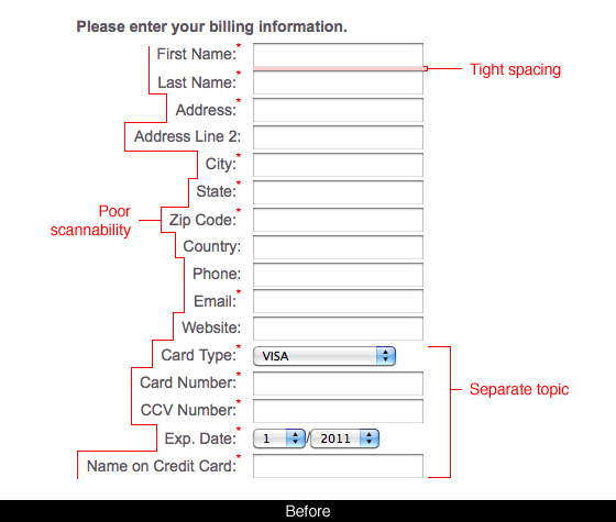
- Poor scannability can lead to the user taking longer to complete your form.
- Tight spacing makes it harder for the user to focus on just one field at a time.
- Long lists of fields with no separation of topics to break up the form flow make the form completion process drag on and can lead to boredom.
After
In the next screenshot, you can tell immediately that there are two sections of the form to be completed and neither is too long or overwhelming. The user can immediately see all of the fields at a quick glance because they are comfortably spaced apart and aligned to the same edge.
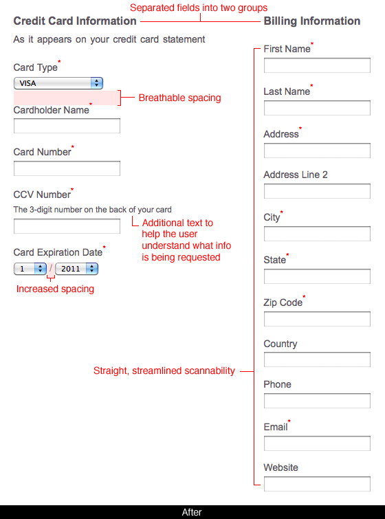
- The list of fields were separated into two groups: Billing information and Credit Card Information. Now there is less risk for the user getting overwhelmed with a long list of fields to scan through.
- The form fields and labels are now stacked on top of each other and left-aligned, which allows the user’s eyes to scan right through the form fields more efficiently than before.
- The spacing between elements is opened up to allow for a more comfortable readability, which expedites the form completion process.
- Additional lines of text were added to clarify the type of information being requested. Some fields can be potentially confusing. Adding a simple description near the form label can help the user quickly understand what to put in that form field instead of making them guess or assume.
Our brains crave structure and order. Simple design techniques like spacing and alignment go a long way in form design. It can mean the difference between a user ordering a product from your website or ordering from your competitor. Give your users the order and structure they need and they will be more likely to give you their business.