We recently launched our first responsive website and I’m very excited to share it with you. With this project reveal, there may be some questions that need addressing:
- What is a responsive website?
- Who should have one?
- What does it look like?
1. What is a responsive website?
Responsive websites are designed and developed to be flexible. These flexible sites can change layout, information, font sizes, image sizes, and navigation. When viewed on different devices such as desktop computers, tablets, and phones. A responsive website’s ability to change sizes and information creates the optimal visitor experience from the same website on multiple platforms.
2. Who should have one?
The right client should have a responsive website. Everyone should have a desktop website and a mobile website, but not everyone should have a responsive website. For example, Back40 does not have a responsive website. Why not? Aren’t responsive websites the latest and greatest? Yes and no. We do not have a responsive website because it does not fit our needs. Here are some things that will tell you if you are the right client for a responsive website or not.
Not the right client if:
- You want to control the layout of your website down to the last pixel.
- You want a very visually intensive website.
- You plan to have a lot of animations on your website.
- You plan to have complex content and navigation on your website.
- You have a more traditional or mature user base.
- You have specific mobile needs.
The right client if:
- You want a clean and simple website.
- You do not plan to have complex content.
- You trust your design and development team to make decisions about how your website scales down to fit the various smaller platforms.
- You are flexible on the layout and realize that your website will not be controlled down to the last pixel.
3. What does it look like?
Responsive websites look like any other website, but often very simple. Most of the time, when you visit a responsive website, you will not even realize it is responsive. You would have to change the size of your browser window to see the responsive changes. Normally we design our desktop responsive websites to display at 960 pixels wide, tablets at 768 pixels wide, and phones at 320 pixels wide. These sizes are called breakpoints. You can have more breakpoints than the three listed; it just depends on the needs of the website.
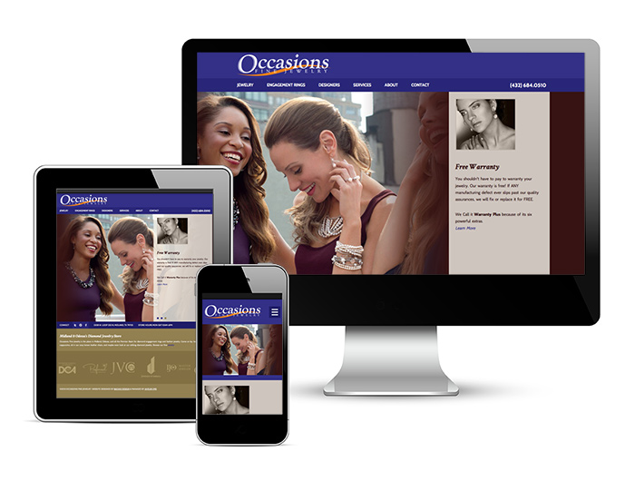
Occasions Fine Jewelry now has a beautiful responsive website. Before the design process, we sat down with them and discussed all the pros and cons of responsive design. Together, we made sure they were the right client. It’s wonderful to work with a client who sees the value in new development techniques, but who does not just jump into it feet first!
Still not sure if you’re the right client for a responsive site? We’d be happy to meet with you and discuss your options.
If you know you are not the right client for a responsive website make sure you have a mobile website. Learn more about mobile websites.