A common topic in my website design meetings with clients is their navigation. Many clients have a preference on horizontal or vertical website navigation. Some things to consider before making the choice…
Content
Content can be a great way to determine if your website navigation should be horizontal or vertical since the navigation is the gateway to the content! Horizontal navigation tends to have a more finished feel on a website, but that is because the company behind the website took the time to really organize and establish that set of navigation for their content.
Go Horizontal
- If you have had a website before and saw little growth or change in the top level navigation pages
- If most of your content can be organized into three or four main categories
Go Vertical
- If you foresee a lot of growth in content (adding top level pages)
- If you want a lot of your content to be presented in a list form right on the homepage and not as sub pages
- If your navigation titles are extremely long or can not be shortened down to one or two words each
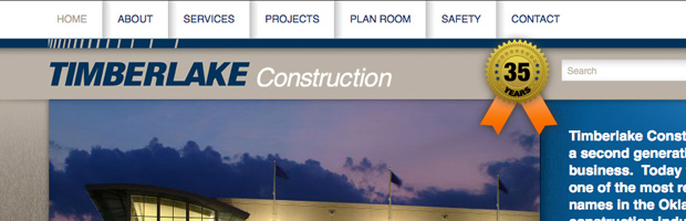
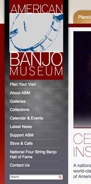 Logo
Logo
The design is presents the content on your site, but you should also take into consideration your logo. Your logo is the base that determines the look and feel of your website. If you have an extremely horizontal logo chances are you may want a horizontal website feel. If you have a very vertical logo a strong vertical website will work great.
Users
There is something traditional about vertical navigation that older users are drawn to. They like the list that the vertical navigation creates. Vertical navigation is also generally on the left side of the page which is easy to find.
If your content and logo both point to having horizontal navigation, but you have an older audience then make sure the navigation is extra clear and easy to locate. You may even use listed sub navigation rather than drop downs paired with that set of horizontal navigation to make navigating to sub pages easier.
Generally, younger users are more drawn to horizontal navigation. Both can be pleasing for any user if the design is right.
If your content and logo both point to having vertical navigation and your audience is young make sure that the navigation looks just as contemporary and well designed as the rest of your site.
One thing to note is almost any user does not like fly out sub navigation on their vertical navigation list. It’s extremely hard at times to roll your mouse horizontally then down to click the right sub navigation item. It’s even worse to have then roll horizontally, then down for the right sub navigation and then roll horizontally again for third level navigation!
Personal Preference
At the end of the day even when considering everything listed above horizontal or vertical navigation is often chosen by personal preference. If you have a personal preference to horizontal or vertical make sure you communicate that to your designer.
When working with client’s personal preference for navigation layout I will advise them on the best choice and talk through their personal preference versus their content, logo, and user experience so both of us can make sure the objectives for the site are accomplished. I may even simply use their personal preference and make sure it is designed to meet the desires of their audience.
Websites without navigation are pretty much worthless so be sure to consider what navigation is right for your visitors and for you. With some thought, planning, organization, and great design your users should be able to navigate your website with ease.