In my last blog on typography I shared how important typography can be in communicating trust, why your designer may choose a sans serif versus a serif, and more. What about communicating your actual message? Here are some tips for making good typography choices for the web to help you clearly communicate your message.
Choose the Right Typeface
Choosing the right typeface for the web should begin with referring to the company’s brand. You don’t want to pick a random typeface, but rather you want the typefaces used to support the consistent look and feel of the company you are designing for. For example, if the client uses a specific sans serif in their logo, tagline, and print materials you should probably use that same sans serif in their web typography. If the companies logo has a unique script you wouldn’t want to choose another script that would compete with their logo.
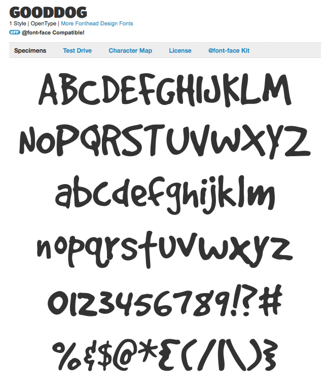
Although in the past typeface choices were limited to common web safe fonts, this is no longer the case thanks to CSS3 @font-face. Now that you are thinking, “what is best for the brand” and considering the newly wide variety of type choices remember to keep typefaces to a minimum for clarity. Use one or two typefaces and then stick with them. If you need variety to break up text you can always use font family options: different font sizes, styles (italic or roman), and weights (bold or regular).
Use Legible Type Sizes
Smaller type tends to look sharp and professional on print pieces. Smaller type on the web can just frustrate your visitors! I learned this when I first started designing for the web. I loved my small understated typography, but on websites it was unreadable. Bigger type can look elementary and childish on a website which can also negatively impact your visitors. It is all about balance and harmony. The general rule for legible type sizes in print is 10 – 12pt and the general rule in web is 12 – 14px.
Style Headings
You don’t want all of the text to be the same on a website. Your users are scanning rather than reading every word of your content. So you want to style various headings to break up your text for better scannability. Here are my general guidelines for heading styles and sizes:
- H1 – Heading One Page Titles – I like to use specialty or display typefaces here. Since the H1s are normally the page title they should be the largest. Generally 22 – 26px
- H2 – Heading Two Section Titles – Sometimes I use the display typeface here again, but in a smaller size. Most of the time I begin using the body copy typeface. Generally 18 – 22px
- H3 – Heading Three – I like to use H3s for call out text on the page and in Javelin CMS we use H3s in module article lists. This heading should stand out a little more than the body copy at bold. Generally 16 – 18px
- Paragraph – Body copy – This is going to be the majority of the text on your web pages so you want this to be very clear, but you should follow the hierarchy established with the headings. Generally 12 – 14px
You should also be styling other type elements like bullet lists and links. I always style all of the headings and these type elements on one page when preparing a website design. It’s important to consider the look and feel when they are all in use. These headings also offer SEO benefits.
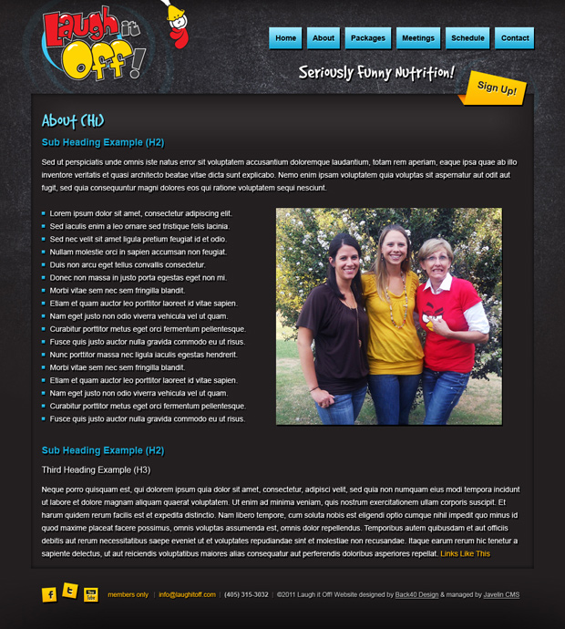
Example of Good Heading Style Typography:

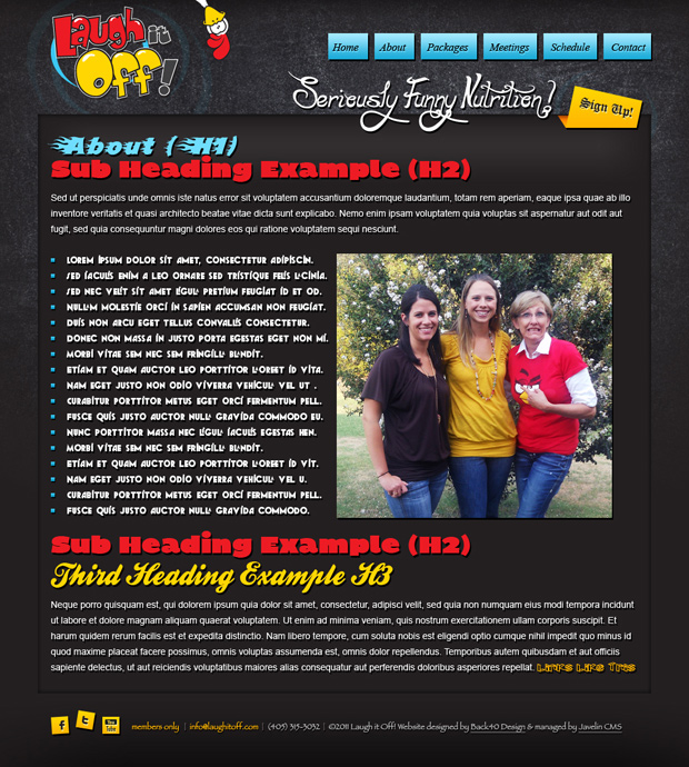
Example of Bad Heading Style Typography:

Create a Visual Language
When all of your headings are styled and all of your elements are present on the page don’t forget to evaluate the visual language your design is speaking. If your buttons and links are yellow you are telling your users that yellow means clickable. You don’t want to then use yellow type to style your heading because then you are breaking your visual language format.
Website are doing more and more these days with custom programming so there will be times when you have to use more than one color to represent links. Luckily shape and color both help establish the visual language. Whatever you do just be consistent and speak the visual language your design created through this consistency.

Observe This Metaphor
Here is my summary of Jonathan‘s metaphor for communicating your message through typography: Clear typography is like music. If you play one song it is clear and beautiful. Your listeners even can hear your lyrics and understand your message. If you try and play multiple songs at the same time, although it will get your listeners attention, it will sound unclear and ugly.
Communicate your message through typography; your message, although it should be aesthetically pleasing, should be presented in the most uncluttered type environment possible.

