 As a designer of course I love typography and as someone visiting our blog…you too may love typography or maybe you need to know a bit about this tool. Knowing more about typography can help you communicate with your designer or even make some better choices when creating simple signs around the office. This is the first of hopefully multiple blogs where I will do my best to describe Typography, the elements of typography, and eventually best typography practices.
Typography
Typography is the design and arrangement of typefaces, point sizes, line lengths, leading, tracking, kerning and more. Typography is the skill your designer should have studied and the skill that naturally helps them make great type choices for your designs.
Life Without Typography
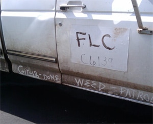
This element of design can sometimes be overlooked – and often is – but I promise you life without typography would not be very pretty. I snapped a photo of this truck while they were servicing the building’s lawn last year.


Would you want to hire this guy? Obviously our building has, but I wouldn’t. Not only does typography make things more appealing, but it also helps us communicate. Communicating a direct message like “FLC C6139 Weed Patrol” is important, but you also may want to communicate a sense of professionalism and trust. I quickly mocked up a little sign using typography to show what a difference it can make. Typography can do this for you. It’s imperative to all of our lives.
Typefaces / Fonts
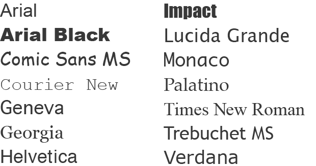
One of the basic elements of typography is the typeface. There is a difference between typefaces and fonts. Typeface is the visual appearance and design of a set of letters. Fonts are what we use to create our design using our chosen typeface. Fonts can be hand set, machine-set fonts, phototype fonts, and digital fonts. So technically speaking when you are referring to the style and design of lettering the correct term is typeface. As a designer, with over five years experience, I still find myself referring to typefaces as fonts now and then so I won’t hold this against you if you do the same on accident. Thankfully most of our computers these days come with a nice set of fonts to help us put a beautiful typeface to work. Here are some fonts you might see on your computer.

It’s important to have an understanding of the classes of typefaces. Here are some general terms and descriptions you may find people using to describe typefaces and fonts:
Serif
Serif typefaces are designed with structured elements at the ends of some of the ascender, descenders, and strokes. Serif typefaces normally give the impression of traditional, professional, and established. The serif typeface when in print form is arguably said to be the most legible choice. Common serif typefaces are Times New Roman and Georgia.

Sans Serif
Sans Serif typefaces do not have the same elements at the ends that the serif does therefore it is the “sans” type. Sans serif in absence of it’s “serifs” is a more simplified font and generally looks more clear. The beauty of sans serif is that it can leave many different visual impacts on the viewer. Sans serif generally gives the impression of contemporary, strong, clean, and simplified. Although serif is said to have better readability in print sans serif is generally said to be more legible for on screen viewing. On screen viewing can refer to web browsing on a desktop computer or mobile devices, television, digital billboards, scoreboards, any other “screen” out there. Common sans serif typefaces are Arial and Helvetica.
While there are theories and even studies on the readability of serif and sans serif your designer generally bases their type choices on look and feel that the typeface offers.

Script
Script typefaces are fluid letter forms without ending strokes. There are formal and casual scripts. Scripts can be used to imply elegance, sophistication, or even the opposite casual and hand made. Common script typefaces are Zapfino and Bickham Script Pro.

Character
Character fonts are extended characters sets grouped with fonts. These can also be called glyphs or symbols. They are not meant to represent actual letters. Common character typefaces are Wingdings and Dingbats.

Decorative
These are the typefaces that do not fall into the other groups as clearly. Decorative typefaces are for novelty and special effect. Since these typefaces are meant for visual impact they should be used sparingly. More to come on that! Common decorative typefaces are Papyrus and Marker Felt.

Now we all have a description to go along with some typeface terms and hopefully this will help you when discussing type design. Even more I hope we all agree we need typography!
