Design For The Better
Design is all about problem solving, innovation, clear communication, and making things better. Have you have ever heard the saying if it ain’t broke don’t fix it? Well, most designers and Back40 do not live by this saying, but rather we live by the saying if it isn’t broken then make it better. Our clients believe in the second saying, too.
Original Flyer
DonationPickup.org asked us to make their flyer better (a redesign if you will). We designed their website, mobile website, and were excited to be working on one of their print designs!
We first considered how the flyers were being used: handed out after someone has donated. The next consideration was the flyers top objectives:
- remind clients to whom they donated
- remind clients to whom their donation is benefiting
- thank the clients for their donation
- encourage the clients to register online
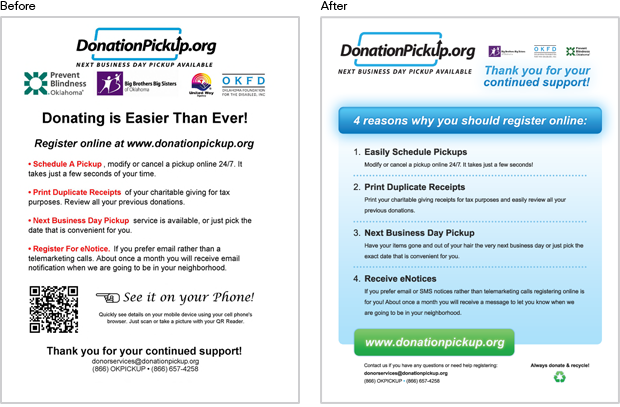
Flyer Redesign
The original flyer met the objectives listed above, so some elements were reused. Our redesign aimed to improve the flyer so that it could complete all of the listed objects and have a more appealing design.
The changes and improvements included:
- moving DonationPickup.org’s logo to the top left, so it is the first thing the donor sees and reminds them with whom they donated
- creating a visual hierarchy within the logos by making the donation beneficiary logos smaller than our client’s logo
- moving the thank you message to the top so that it is the very next element the donor will see when using the Gutenberg Diagram Z Layout and examining the follow paths
- revising the headline to read “4 reasons why you should register online” to sound more personal and encouraging
- breaking the key reasons to register online down into four numbers and separating them more clearly for scan-ability
- changing the colors to carry over DonationPickup.org’s branded colors for brand consistency and creating a more pleasant look
- emphasizing the web address and placing it on green to imply GO register online
- removing the QR code since the clients receiving the flyers are generally in their homes and more likely to go to the website on their desktop computer
- making the contact information smaller so that the other, more important objects are not competing
- signing off with a positive reminder, “Always donate & recycle,” encouraging the clients to donate again
The easiest thing to do is to go on using the same ol’ print materials for your company, but is it really the best thing? Why not make things better? Better design will get you better results and communicate the right message to your clients.