Over the last several years, photography has become one of the most crucial parts of any good website. Viewers love seeing interesting imagery on websites, which leads to a memorable experience. Here are a few tips for making sure your photography is shot in a manner that will allow it to be easily used for the web.
Composition/Hierarchy
In shooting for the web, it’s beneficial to consider what you’re actually shooting for. Is it a background image? A hero or main image? If the image is full of exceptional detail, it will be frustrating if you have to lay type over it and it creates legibility issues for both the copy and the subject of the photo. Knowing beforehand what you’re using the image for will help you prioritize the visual information within the scene. If the image is just there to support the copy on the page, it’s best to not have it visually overwhelm and steal the spotlight of the content.

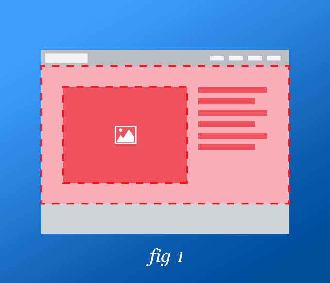
Figure 1: This shows the entire image shot with the subject staged toward the left and space reserved on the right to impose website elements without obstructing the subject.
Take a step back
Once you’ve squared up your perfect shot – do me a favor, and take a step back. Take a few steps back. Adding extra environment around your subject will allow you extra room to work with. The space where you plan on adding a photo can change, but there is a limit to the amount of manipulation you can do to get it to fit that space. This will also help when the layout acts responsively with the website.
Proportions
The proportions of your photo are almost as important as the subject. The goal is to preserve the highest amount of visual information within the given area, and to do this, you can plan to have more of your subject in the central area of the photo. You can also plan ahead if you know the shape of the area the image will live in. Is it horizontal? Shoot your images to where the important visual information is centered along a central horizon line. Is it vertical? Focus information along a central vertical line. Trying to use a horizontal image in a vertical space will force you to exclude a ton of the image, which might alter the message it communicates.

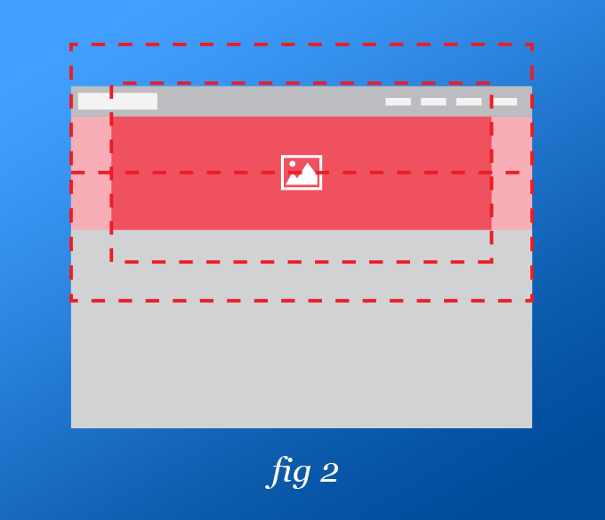
Figure 2: This shows that most of the subject of the photo is still present when placed in a narrow, more horizontal image space.

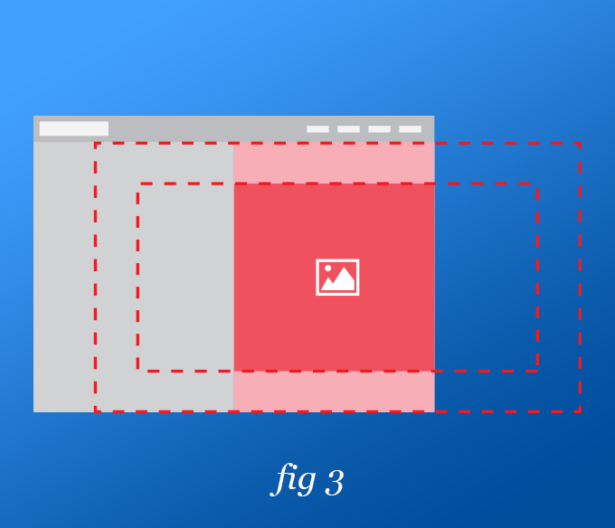
Figure 3: This shows the amount of image lost to putting a horizontal image in a vertical area. Or as I like to call it: square peg in a round hole.
Following these tips will help get your photography to a place where it adds to the aesthetic of your website, instead of subtracting from it.
If you’re needing some expert help, we’ve got you covered. Contact us about our standard and drone photography services.
